Menus (Options lists)

|
Summary:
|
Java
Related design guidelines |
Options list
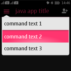
Figure 1. Options list with touch down state on the second item
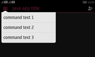
 Figure 2. Options list in landscape
 |
Options list is a UI component embedded in the header bar, positioned on the left edge of the screen and always identified by an icon.
When Options are open, the whole content area in the background is dimmed. Text labels in lists are always one row. Options menu contains global functions for that state. The order of the items is defined by priority.
If no commands are defined for the Options list, the icon is shown dimmed. When there are more items than fit to the options list window, to hint that the menu is scrollable, the last item of the list is partially cut. While scrolling, a scroll bar fades in to indicate the length of the list. Even though Options lists can be scrolled, it is recommended to avoid overloading. See the section ‘Confirming changes’ for details of in which cases a confirmation note should be shown to the user when a selection is made. |
Context menu
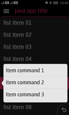
Figure 3. Context menu. The item highlighted in background has been long-pressed.
 |
When a user performs long press on an object, a context menu opens as shown in the figure above.
A single tap action for an object should not be duplicated in its context menu. For example, if single tap on the item opens it in a new view, the context menu should not contain action 'Open' and duplicate the functionality. Context menus should not be the only means of activating an action, because they are less discoverable than onscreen buttons or the Options list, and they may not be found by all users. Therefore, it’s recommended that the actions in the context menu are also made available in the next state down in the navigation hierarchy (e.g., in the normal Options list). Because of this duplication, using the context menu is considered a shortcut for going to the next screen and performing the operation there. |